Alerts
Alerts highlight important information that needs to be communicated quickly to the user.
Last updated
Alerts highlight important information that needs to be communicated quickly to the user.
Last updated
Alerts are meant to attract users' attention and provide them contextual information. Use them cautiously, as they can become overwhelming.
An alert is always composed of at least an icon and a title. The dismissible feature is optional, displayed with a close icon in the top right corner. Short description (children prop) and Action Button are optional.
Only one CTA can be displayed in an alert. It can be used to perform a direct action or redirect users to another page.
If more documentation is available, add a hyperlink "Learn more about ..."
at the end of a description.
Immediate Attention Required: Utilize Alerts to convey essential information that demands the user's immediate attention.
Contextual Information: Implement Alerts to offer contextual guidance or feedback in response to user actions, enhancing their understanding and decision-making process.
Non-Essential Information: Avoid using Alerts for non-essential information that could detract from the user experience, such as promotional content or marketing messages.
Overuse: Refrain from excessive use of Alerts, as this can lead to user desensitization to important messages and potentially overwhelm the user.
Alerts convey different levels of severity. We have determined 5 stages of severity: from general information to critical issues.
Each of the 5 levels has its design style:
Loading Alert is a variant of Alert
to be used when users are uploading a file into the platform.
This component is a piece of visual information informing users their request is being processed and should wait until its completion.
Loading Alert is an Info Alert
(blue) with a spinner icon
Alert Compact
is a streamlined version of the standard Alert
, optimized for use in constrained spaces where only a succinct message is necessary, with no actions.
It is ideal for panels, modals or sections of the interface where minimalistic feedback is required.
Alert Compact
is a component in itself, not a variant of Alert
.
You cannot use this alert in Date Time Range Modals
An alert focuses on a specific topic or piece of information and provide only one main call to action.
The text should be concise and clear so that users understand right away what's going on on the page. Capitalize only on the first word, with no period at the end.
Template: < 2 to 3 words>
1 to 2 sentences
Capitalize the first word, use full stop
Avoid repeating the heading
Avoid phrases like ‘You can’. They are not decisive enough for users
Add any information to help the user understand what's happening on the page.
Template: < 1 sentence to help users understand what’s happening now >
Explain the impact of the action and what's going to happen next.
Template: < 1 sentence to explain what’s going to happen next >
Explain how the user can fix what went wrong. You may add a hyperlink to redirect users to the documentation if needed.
Template: < 1 solution-oriented sentence to help users fix what went wrong >
Microcopy should follow button guidelines.
Template: < Action verb (+ noun) >
To communicate the level of severity, we combine a color pattern with a specific icon. Do not change the icon under any circumstance, as colors are not perceived the same way by everyone (disabilities, cultures ...).
Keep labels and descriptions clear and concise
Set clear expectations on user's action in the title
Display only one action per alert
Add a link to the documentation if more information is available
Do not change icons
Do not forget the title (never display only the description and CTA)
Do not use "Please" or "Thank you" or Latinisms
Do not add actions to Compact Alert
Type | Color | Icon | Info displayed |
---|---|---|---|
Loading
Blue
loading
Display information about a loading item
Info
Blue
info
Display general information
Success
Green
check_circle
Inform about the success of a previously performed action
Warning
Yellow
warning
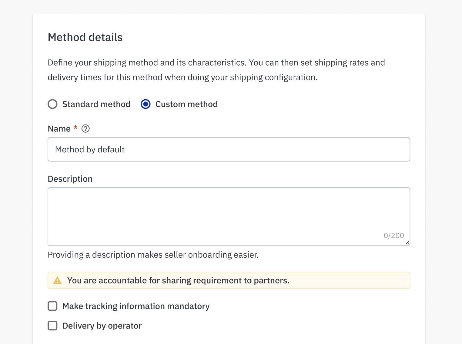
Display important information that the user should notice or take action on
Error
Red
error
Alert about a very critical issue (suspension, errors, etc)