Mirakl Design
Mirakl Design
  • Getting started
    • Welcome to Roma
      • Design principles
  • Design
    • Components
      • Actions
        • Action menu
        • Buttons
        • Button group
        • File download
        • Save bar
        • Tasklist
        • Contextual Toolbar
      • Datalist
      • Datatable
      • Feedback
        • Alerts
        • Activity Loader
        • Badge (status)
        • Empty state
        • Snackbar
      • Form
        • Fields
        • Pickers
        • Selection controls
        • Tree
      • Images
        • Illustrations
        • Icons
        • Media
      • Navigation
        • Hyperlink
        • Page title
        • Sidebar
        • Top bar
      • Overlays
        • Modal
        • Popover
        • Tooltip
        • Side Drawer
      • Structure
        • Global layout
        • Panel
          • Activable Panel
          • Clickable Panel
          • Expandable Panel
          • Panel tabs
          • Totalizer Panel
        • Card
    • Patterns
      • Advanced selection
      • Configure options
      • Displaying data
      • Displaying history
      • Errors
      • Forms
        • Form - Creation mode
        • Form - Edition mode
        • Form - In a modal
        • Error Management
        • Stepper form
        • Onboarding form
      • Loading
      • Progressive disclosure
  • content
    • Writing for Mirakl
      • Grammar and formatting
    • Vocabulary
      • Mirakl products
      • Which verb to use
Powered by GitBook
On this page
  • Checkbox
  • Activable Panels
  • Radio group card

Was this helpful?

  1. Design
  2. Patterns

Configure options

Simplify user choices in configuring their settings.

Last updated 1 year ago

Was this helpful?

Overview

Configuring settings can significantly affect user operations, whether options are turned on or off. Clear design simplifies decision-making and minimizes confusion. We employ various design elements such as checkboxes and activable panels to ensure the process is clear and user-friendly.

Checkbox

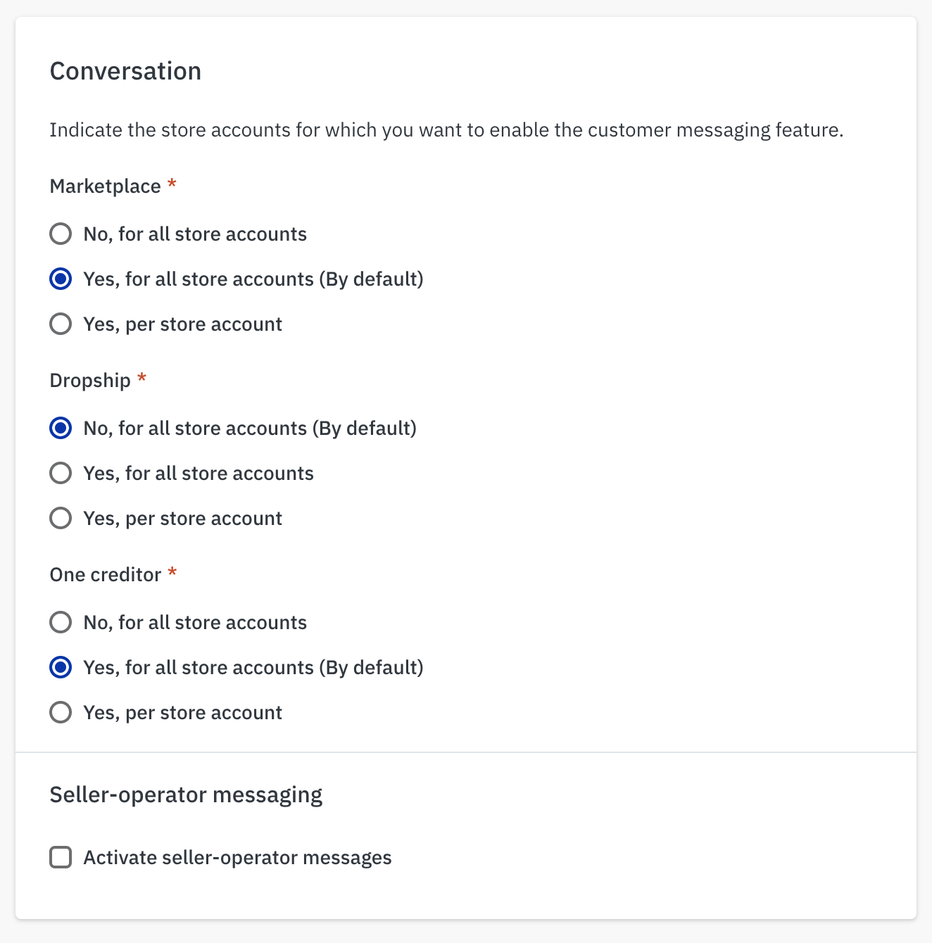
  • Usage: Employ a simple checkbox to enable users to opt into a simple feature. Checkboxes are suitable for straightforward options and can be displayed individually or grouped with others that are semantically related to streamline the user interface.

  • Implementation: Since checkboxes are form elements, a save bar is required to commit any changes made.

Activable Panels

  • Benefits: Using these panels helps keep your form neat and easy to understand. It reduces the need for many checkboxes and makes the form less confusing.

  • Important Note: When you activate a panel, it might show a lot of new information. Make sure that this information is necessary and does not overwhelm the user.

  • Activable Panel or Switch inside the panel ?

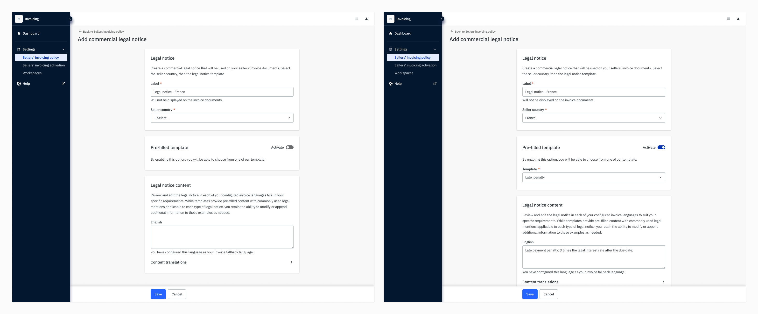
    • If activating a setting shows or hides the entire panel, use the Activable Panel.

    • If different elements in the panel are shown or hiden separately, use one or several switch within the panel to control these changes.

Radio group card

  • Usage: Use a Radio Group Card when users need to choose between two or three options, each with its own related settings.

  • Functionality: This component lets users easily switch between different options. It keeps the user interface tidy and makes it clear when moving from one option to another.

  • Important Note: Use this component in a column layout, not in a row.

An can show or hide parts of a form depending on whether a setting is turned on or off. It does not save any changes by itself.

Activable Panel
exemple of how a checkbox is used to activate an option
Exemple of the use of an Activable Panel
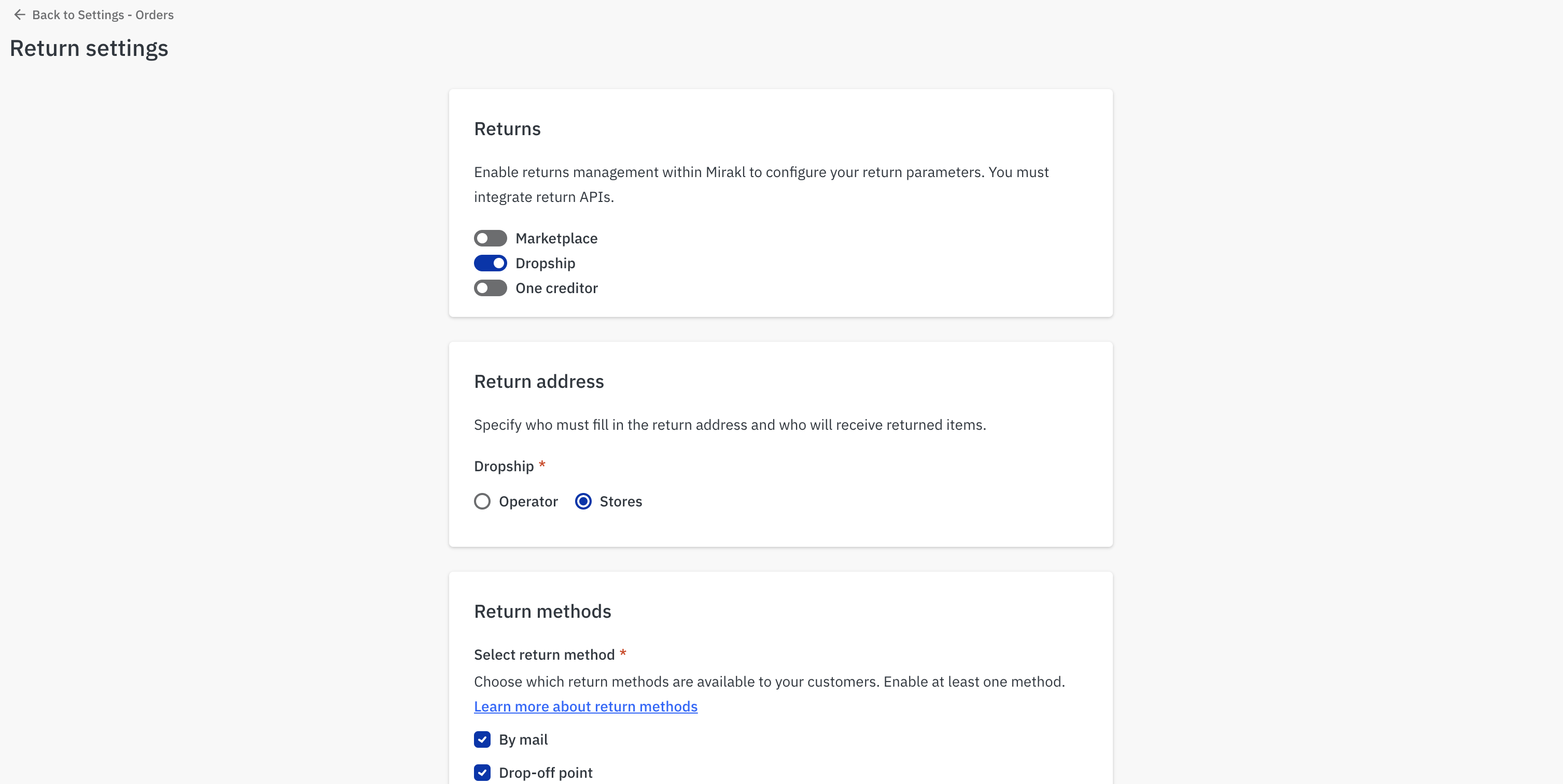
Exemple of using several switches in a panel
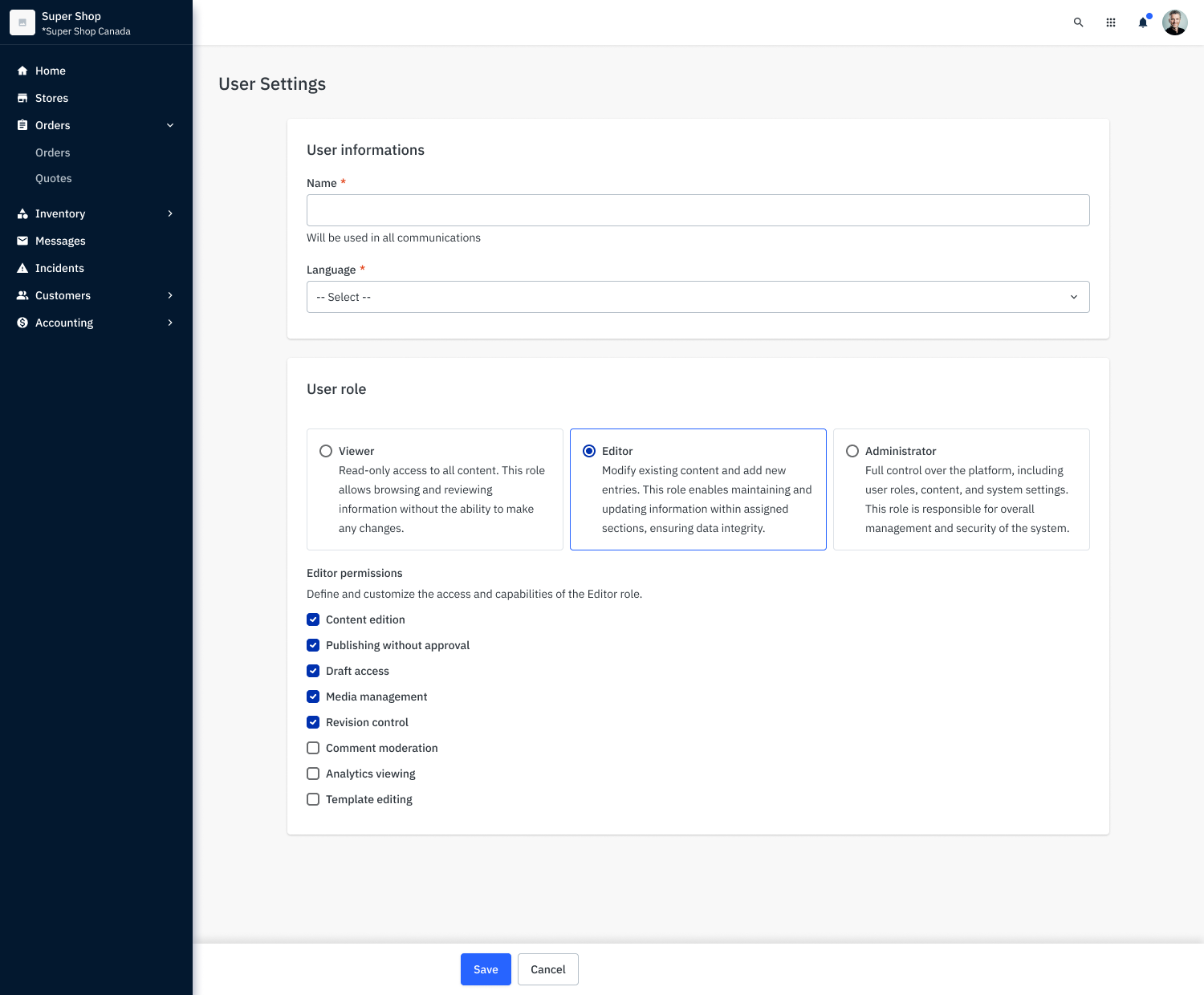
exemple of a use of Checkbox Group Card to configure options