> For the complete documentation index, see [llms.txt](https://design.mirakl.com/llms.txt). Markdown versions of documentation pages are available by appending `.md` to page URLs; this page is available as [Markdown](https://design.mirakl.com/design/components/overlays/side-drawer.md).
# Side Drawer
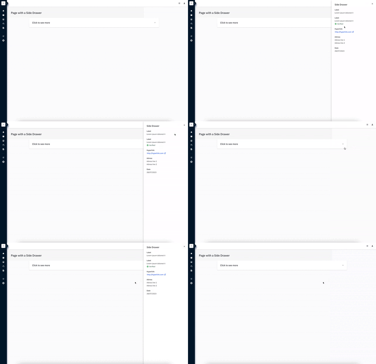
A drawer is a panel that slides in from the right side of the viewport.
Exemple of a Side Drawer
## Overview
`Side Drawer` is an overlaid panel : it appears on top of a page and slides in from the right side of the viewport.
This component is useful when we want to organize a page content into different levels. Defer secondary content helps to limit visual clutter and minimize cognitive load. That said, this content must remain easily available and appear when users intends to expose it.
Typical use case is to deep dive into a specific element without having to leave the current page. That way, tasks can be achieved more efficiently within the same context.
Exemples :
* Take a closer look into a datatable element
* Opening a large list of datatable filters
* Opening details of a datalist element
* Take quick actions
## Guidelines
### Layout
#### Sizes
The `Side Drawer` comes in three sizes to accommodate its content. It's up to designers to decide which size is more appropriate for visualizing the content.
* Small : 356px
* Medium : 450px
* Large : 600px
#### Compatible components to use with Side Drawer
The only mandatory component to display in the `Side Drawer` is the `title`. It helps users to understand to which element `Side Drawer` is related to.
The content of the `Side Drawer` is *almost* design-free. However, keep in mind to make it easy to read. Therefore, we have prohibited the use of the [Expandable Panel](/design/components/structure/panel/expandable-panel.md) inside the `Side Drawer`, as it may introduce excessive complexity, affecting readability.
### Behaviors
#### General behaviors
When the drawer is open, all actions on the main page are disabled. Users must close the drawer to perform any actions on the main page.
A datatable row can open a side drawer, not just the hyperlink (href) cell.
#### Exit behaviors
There is several ways to exit `Side Drawer` :
* A `Close Button,`always available to the top-right corner.
* A Click outside of the `Side Drawer` area
* An action through a `Primary Button` of the `Save Bar`. Though it is optional, to add a Save Bar
## Accessibility
When using a keyboard to navigate the interface, user can use the 'Esc' key, also known as the Escape key, to exit or close the drawer.
---
# Agent Instructions
This documentation is published with GitBook. GitBook is the documentation platform designed so that both humans and AI agents can read, navigate, and reason over technical content effectively. Learn more at gitbook.com.
## Querying This Documentation
If you need additional information that is not directly available in this page, you can query the documentation dynamically by asking a question.
Perform an HTTP GET request on the current page URL with the `ask` query parameter, and the optional `goal` query parameter:
```
GET https://design.mirakl.com/design/components/overlays/side-drawer.md?ask=&goal=
```
`ask` is the immediate question: it should be specific, self-contained, and written in natural language.
`goal` is optional and describes the broader end goal you are ultimately trying to accomplish on behalf of the user. GitBook uses it to tailor the answer towards what is most useful for that goal.
The response will contain a direct answer to the question and relevant excerpts and sources from the documentation.
Use this mechanism when the answer is not explicitly present in the current page, you need clarification or additional context, or you want to retrieve related documentation sections.